Part 5 - Generative UI (GenUI)
One of the most powerful features of Sidekicks is their ability to generate responses that render custom UI components directly in the conversation flow. That is, instead of only emitting text, a Sidekick can emit buttons, cards, tables, and more, picking the best UI components to use based on the response. In this section, we'll show you how to extend your Sidekick to use this Generative UI capability, which we call GenUI for short.
In Part 4 we covered tools and added one for the GitHub Graphql API to our Sidekick.
In Part 5, you will:
- Learn how Sidekicks can go beyond simple text chat and dynamically use UI components.
- Cover the built-in GenUI components.
- Understand how to add custom components and make those available to the model via GenUI.
Introduction to GenUI
When you create a Sidekick, the outputFormat parameter passed to the <Sidekick> component
indicates the type of output that the Sidekick produces. There are three options:
text/plain- The Sidekick produces plain text responses only.text/markdown- The Sidekick produces Markdown, which can include standard Markdown elements like lists, tables, and code blocks.text/mdx- The Sidekick produces MDX, which is essentially Markdown with embedded JSX components.
When using text/mdx (which is the default), the Sidekick generates Markdown potentially
interspersed with GenUI components. An example might be something like the following:
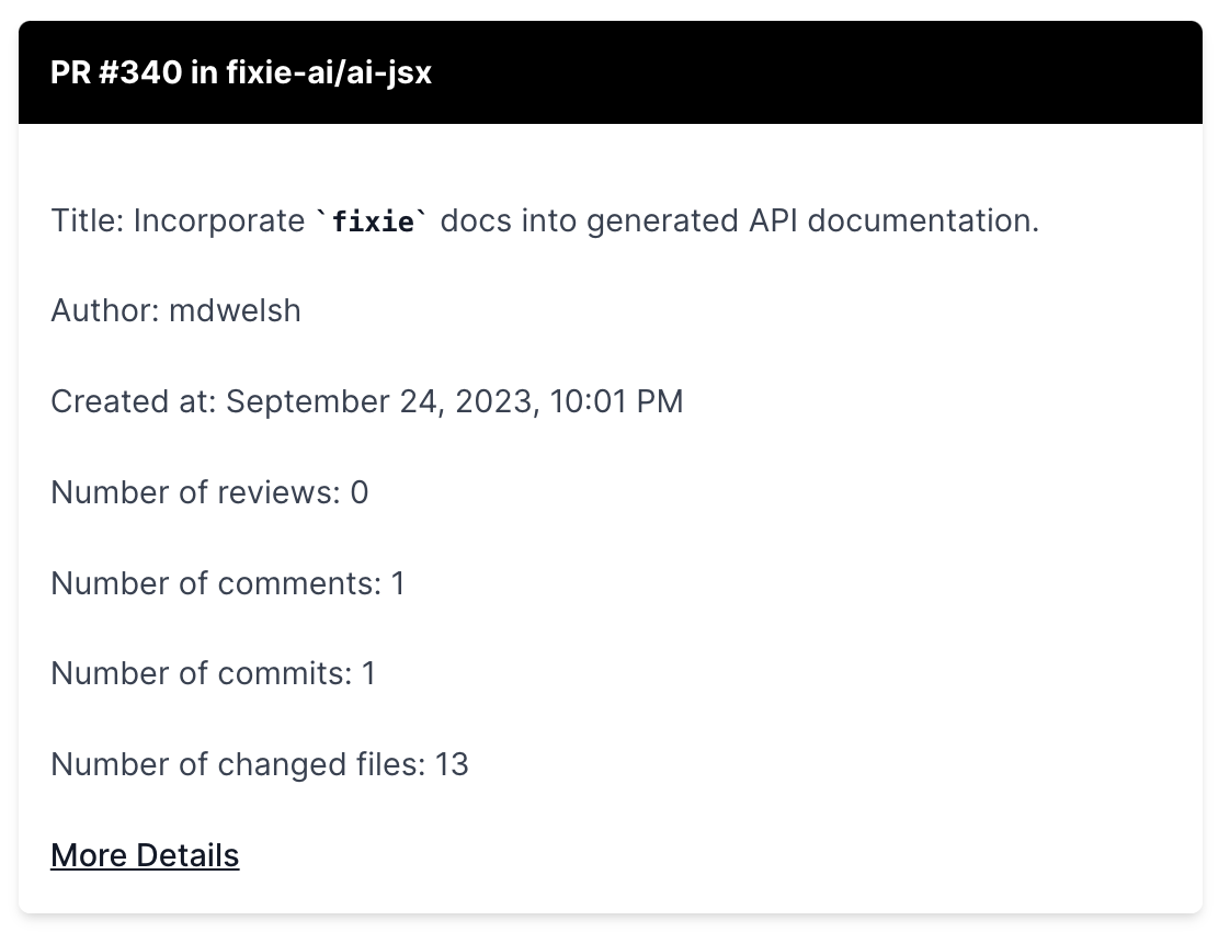
  Sure, here is the latest pull request assigned to you:

  <Card
    header="PR #340 in fixie-ai/ai-jsx"
    moreDetailUrl="https://github.com/fixie-ai/ai-jsx/pull/340"
    moreDetailLabel="Link to PR#340"
  >
  Title: Incorporate fixie docs into generated API documentation.
  Author: mdwelsh
  Created at: September 24, 2023, 10:01 PM
  Number of reviews: 0
  Number of comments: 1
  Number of commits: 1
  Number of changed files: 13
  </Card>
When rendered in the Sidekick UI, this will show a card with the given information, like this:
Standard GenUI Components
The standard Sidekick UI renderer understands how to use three MDX components:
<Card>- A card with a header, some contents, and an optional more detail link.<Citation>- A citation that includes a title and a link.<NextStepsButton>- A button that, when pressed, sends the contents of the button text as the next query to the Sidekick.
As long as the outputFormat parameter to the <Sidekick> component is set to text/mdx ,
there is nothing more you need to do to get the Sidekick to use these standard components.
Helping the Sidekick know when to use GenUI components
Even though the <Card> , <Citation> , and <NextStepsButton> components are available
to the Sidekick, it won't always use them. It is often helpful to give the Sidekick some
additional examples in terms of when it should use these UI elements.
For this, we are going to add a new <SystemMessage> that we'll pass to the Sidekick, giving
it some concrete examples of when to use them.
export const finalSystemMessageBeforeResponse = (
  <SystemMessage>
    Respond with a `Card`. If your API call produced a 4xx error, see if you can fix the request and try again.
    Otherwise: Give the user suggested next queries, using `NextStepsButton`. Only suggest things you can actually do.
    Here's an example of what the final outcome should look like:
    {`
        <NextStepsButton prompt='See more about this function' />
        <NextStepsButton prompt='See all of the stars for this repository' />
        `}
    When you give next steps, phrase them as things the user would say to you. Also, only give next steps that are fully
    actionable by you. You cannot call any write APIs, so do not make suggestions like `create a repository`.
  </SystemMessage>
);
To use this in our Sidekick, we're going to pass it in as a finalSystemMessageBeforeResponse ,
like so:
<Sidekick
  role="GitHub assistant"
  systemMessage={systemMessage}
  tools={tools}
  finalSystemMessageBeforeResponse={finalSystemMessageBeforeResponse}
/>
See GenUI in Action
Now let's go back to our Sidekick and retry a couple of our earlier queries:
How many PRs are assigned me?
What is my most recent pull request?
You should now see a more visually interesting UI along with related, additional queries to try displayed as buttons.
Adding custom GenUI components
It is possible to get the Sidekick to use your own, custom MDX components in its output. The challenge here is ensuring that the rendering front-end to your Sidekick incorporates those additional components. The generic Sidekick UI provided by Fixie is not yet extensible, so you would need to build your own UI frontend that renders the MDX generated by the Sidekick, using the GenUI components you provide. This is left as an exercise for the reader!
To add your own GenUI components to the Sidekick, you can provide
the optional parameters genUIComponentNames and genUIExamples to the <Sidekick>
component, like so:
const genUIComponentNames = [ 'MyTable' ];
const genUIExamples = (
  return <>
    Whenever responding with tabular data, the {'<MyTable />'} component. Its interface is:
    {`
    interface MyTable {
      header: string
      columnNames: string[]
      rowData: string[][]
    }
    `}
  </>
);

const mySidekick = (
  <Sidekick
    role="Github Assistant"
    systemMessage={systemMessage}
    tools={tools}
    finalSystemMessageBeforeResponse={finalSystemMessageBeforeResponse}
    genUIComponentNames={genUIComponentNames}
    genUIExamples={genUIExamples}
  />
);
Of course, it's your job to implement the <MyTable> component in your own UI.
This section provides some optional, suggested exercises you can do to go deeper with your usage of Sidekicks.
Changing up the <SystemMessage>
Try changing the <SystemMessage> to encourage the Sidekick to use different components
for different use cases. For example, maybe you want it to always generate a <Citation>
when it is giving a link to a GitHub issue or pull request, rather than using a <Card> .